
Retirement Safety Score
advisor platform for turning complex retirement inputs into a clearer client conversation
Retirement Safety Score began as a blank slate. The client wanted to stand up software that financial advisors could use with prospective clients, whether in an advisor-led conversation or through a self-service experience completed at home.
The product needed to bring together a substantial amount of retirement information, organize it into a usable workflow, and turn it into a clear conversation. Advisors needed to manage leads, prospects, and clients while understanding where each person was in the process. Clients needed to see how their current situation compared with a recommended scenario without being overwhelmed by unfamiliar financial concepts.
I worked directly with the CEO to turn an evolving set of requirements into a product strategy, end-to-end experience, and coherent interface system.
0→1 product and UX strategy
Content strategy and information architecture
Advisor-led and self-service intake journeys
User journey mapping and wireframes
Advisor CRM dashboard
Role- and permission-aware client access patterns
Client-facing score and scenario views
UX/UI design and a new design system
Scope
Role & Ownership
I owned the product-design work from early strategy through handoff. I defined the product and content strategy, mapped journeys, created wireframes, designed the advisor and client experiences, and established a new design system.
I worked directly with the CEO as requirements evolved, translating the product’s financial model and operating needs into flows that advisors and clients could understand. The client brought the domain requirements and decision logic; I shaped how those requirements became a usable end-to-end experience.
The Real Problem
The product had to support a high-stakes conversation without expecting ordinary people to understand the language of financial modeling. Information such as income sources, expenses, investable assets, advisor fees, average return, downside volatility, and maximum drawdown can be difficult to interpret in isolation. Yet that information needed to be gathered accurately enough to drive a meaningful score and a recommended scenario.
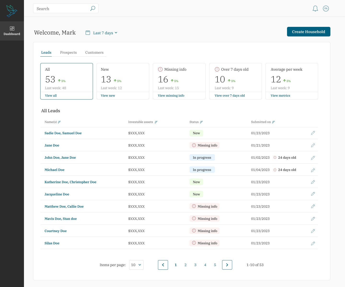
At the same time, this was not only a client questionnaire. Advisors needed an operational workspace: a way to manage new leads, prospects, and clients; see a person’s progress; identify missing information; review client data; and control whether someone could view or edit it.
The central design challenge was to connect those two sides of the product. The intake, advisor workflow, and client-facing score could not feel like separate tools. They needed to form one understandable path from first conversation to next step.
What Mattered Most
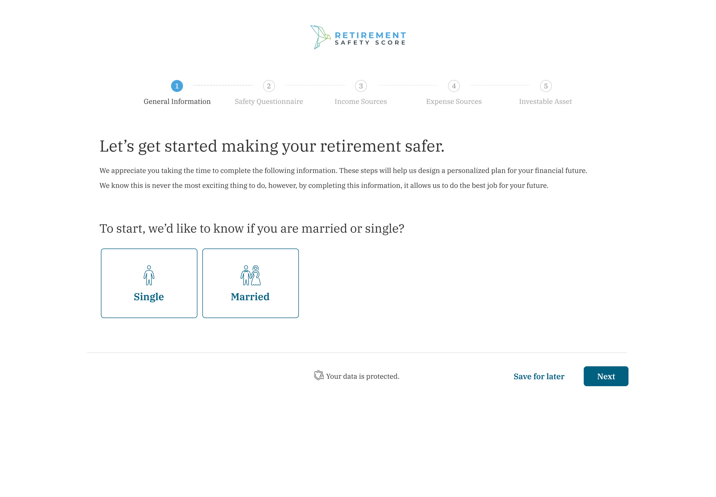
The first priority was making a complex financial intake feel manageable. I organized the self-service flow into clear sections—general information, safety questionnaire, income sources, expense sources, investable assets, and current advisor fees—so people could work through the information in smaller, understandable steps.
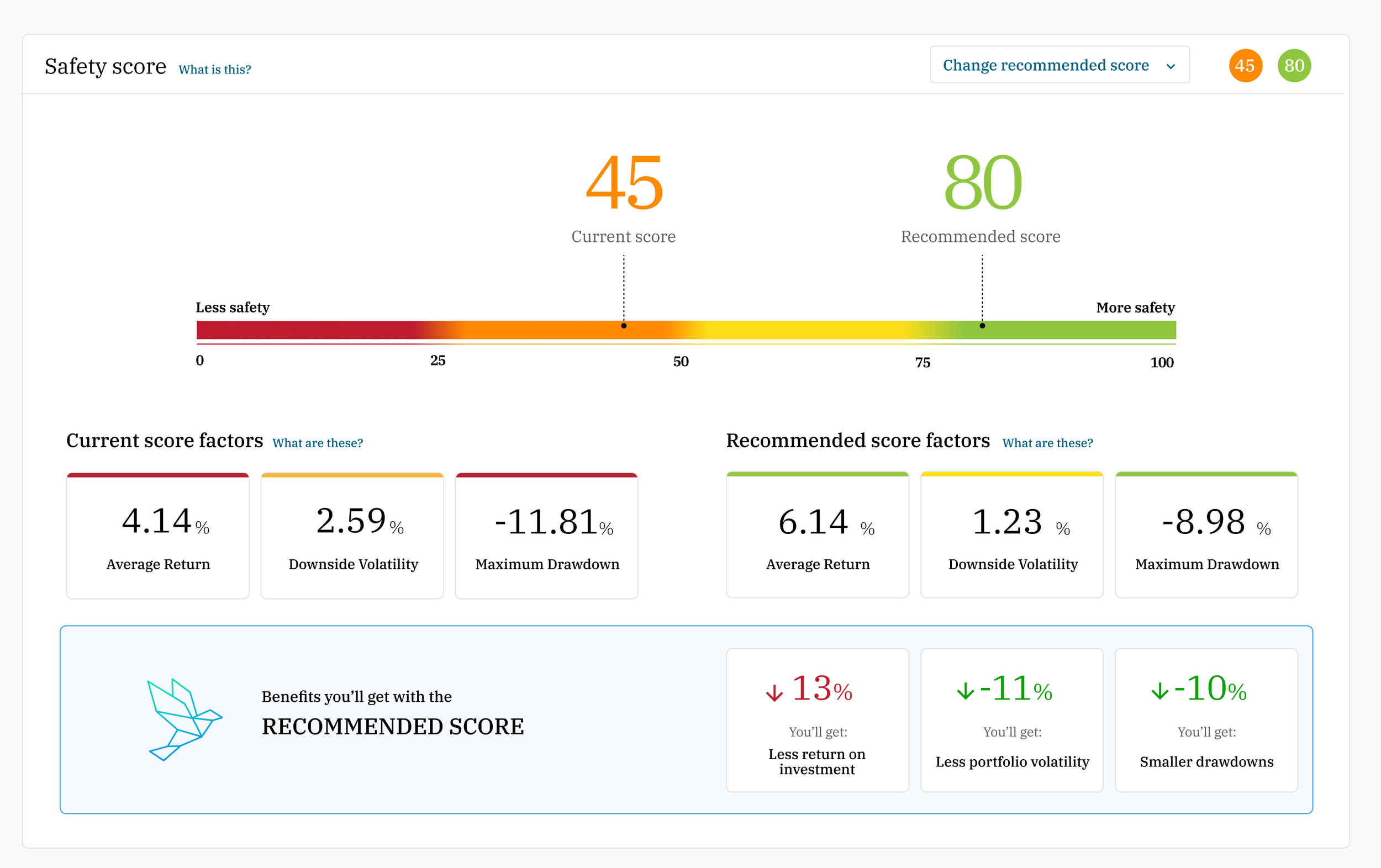
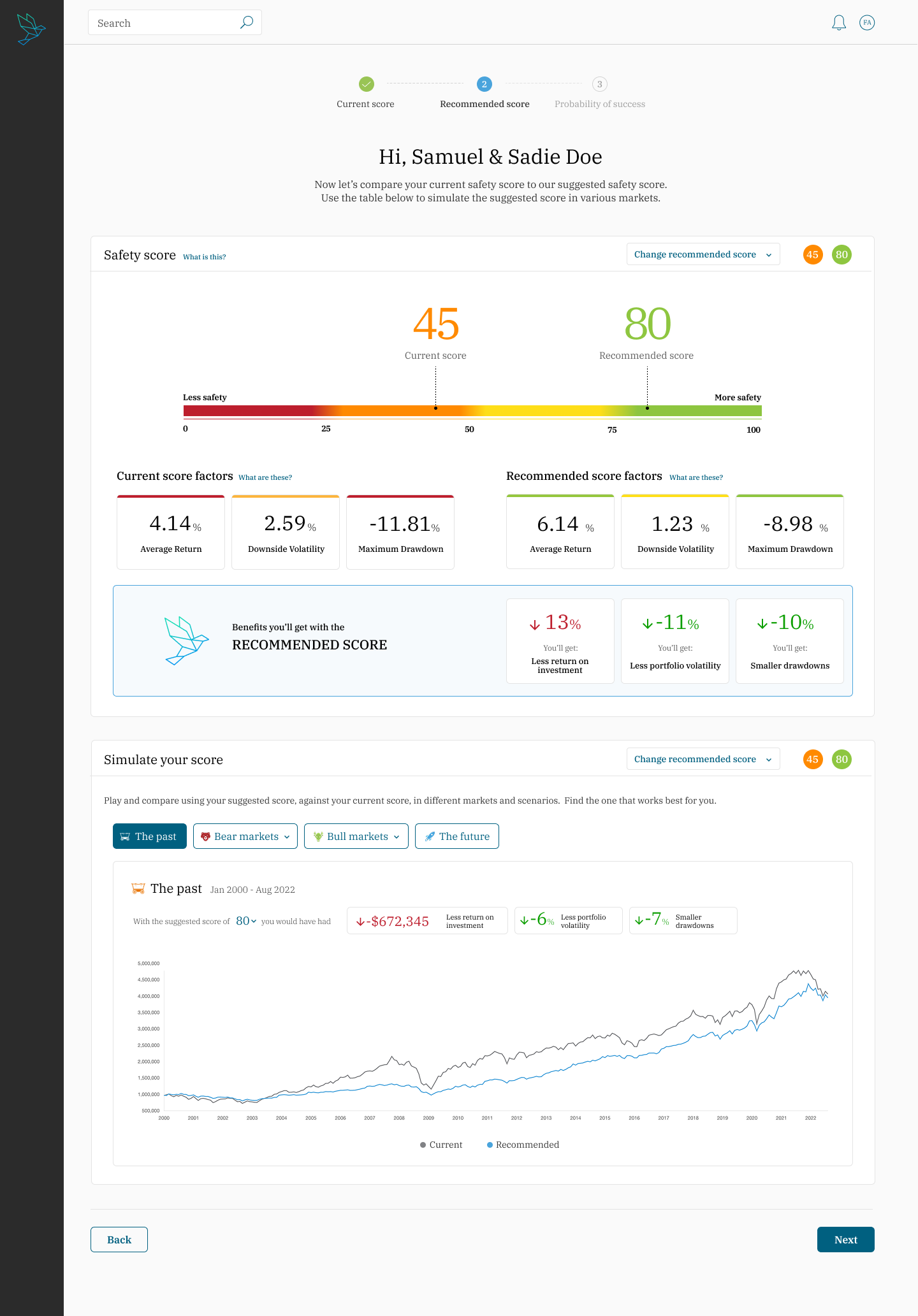
The second was explainability. A score alone would not help a client understand what was changing or why. The experience needed to make the comparison between a current scenario and a recommended scenario legible, while providing plain-language help around concepts that might otherwise be unfamiliar.
Finally, the advisor needed to remain effective throughout the process. The product had to accommodate an advisor guiding the conversation live as well as clients completing information on their own time, then give advisors an organized way to pick the conversation back up.
Key Decisions
I designed one connected experience for advisor-led and self-service progress
I mapped the product around the same core retirement-information flow regardless of whether an advisor was present or a client completed it at home. The guided intake broke a large set of inputs into progressive sections, with clear progress cues and the ability to save work for later. This gave the advisor a structured way to lead a conversation while allowing clients to continue independently when needed.
I made the advisor dashboard an operational center, not a list of names
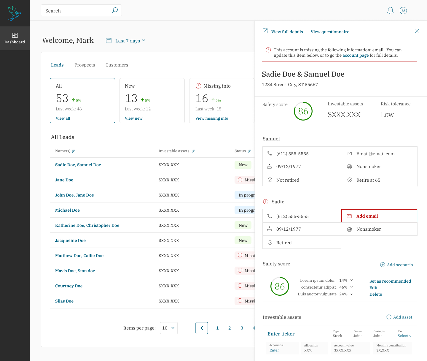
I designed the advisor workspace around the work required to move people through the process: new leads, prospects, clients, progress visibility, missing-data review, and access controls. Advisors could use the dashboard to understand who was in motion, what information remained, and who should be able to view or edit a record.
I turned the score into an explanation, not a black box
The score views compared a client’s current situation with a recommended scenario and surfaced the factors behind the comparison. I used supporting information and contextual help to make concepts such as average return, downside volatility, and maximum drawdown more approachable. The goal was not to reduce complex reasoning to a single number, but to give advisors and clients a shared, understandable basis for discussing it.
I created a consistent system across multiple roles and information states
The platform needed to work across intake, CRM, permissions, client records, scenario comparison, and educational content. I created a new design system to give those experiences a common visual and interaction language, then carried it through the advisor dashboard and client-facing views.
Outcome
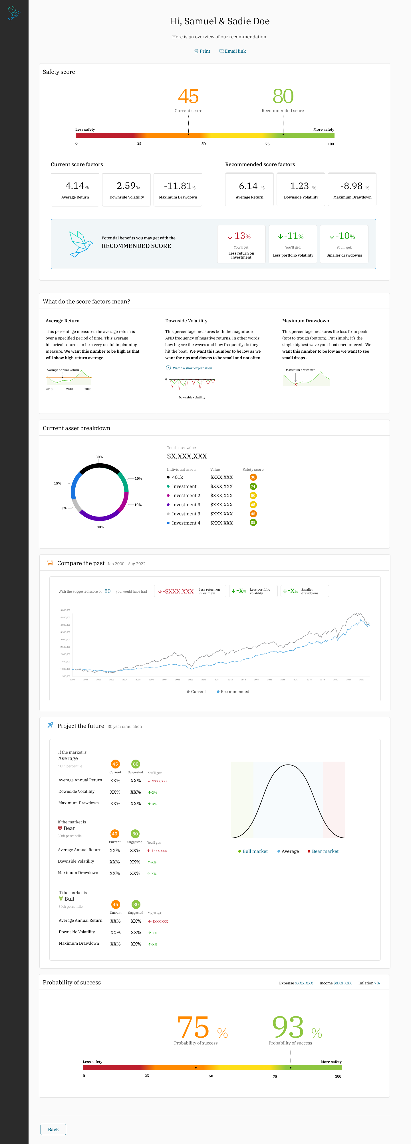
The work produced a complete product direction for Retirement Safety Score: an advisor dashboard, guided intake, role- and permission-aware client management, and client-facing score views that compared current and recommended scenarios. The CEO approved the direction, the work was handed to engineering, and the product launched.
I do not have verified adoption, conversion, financial-performance, or usability metrics for the public case study. The demonstrable outcome is a launched 0→1 product experience that brought the company’s retirement-safety model into advisor-guided and self-service workflows.
