Generac
Redesigning Generac's PWRview energy-monitoring experience so homeowners could understand the connected energy system behind their home.
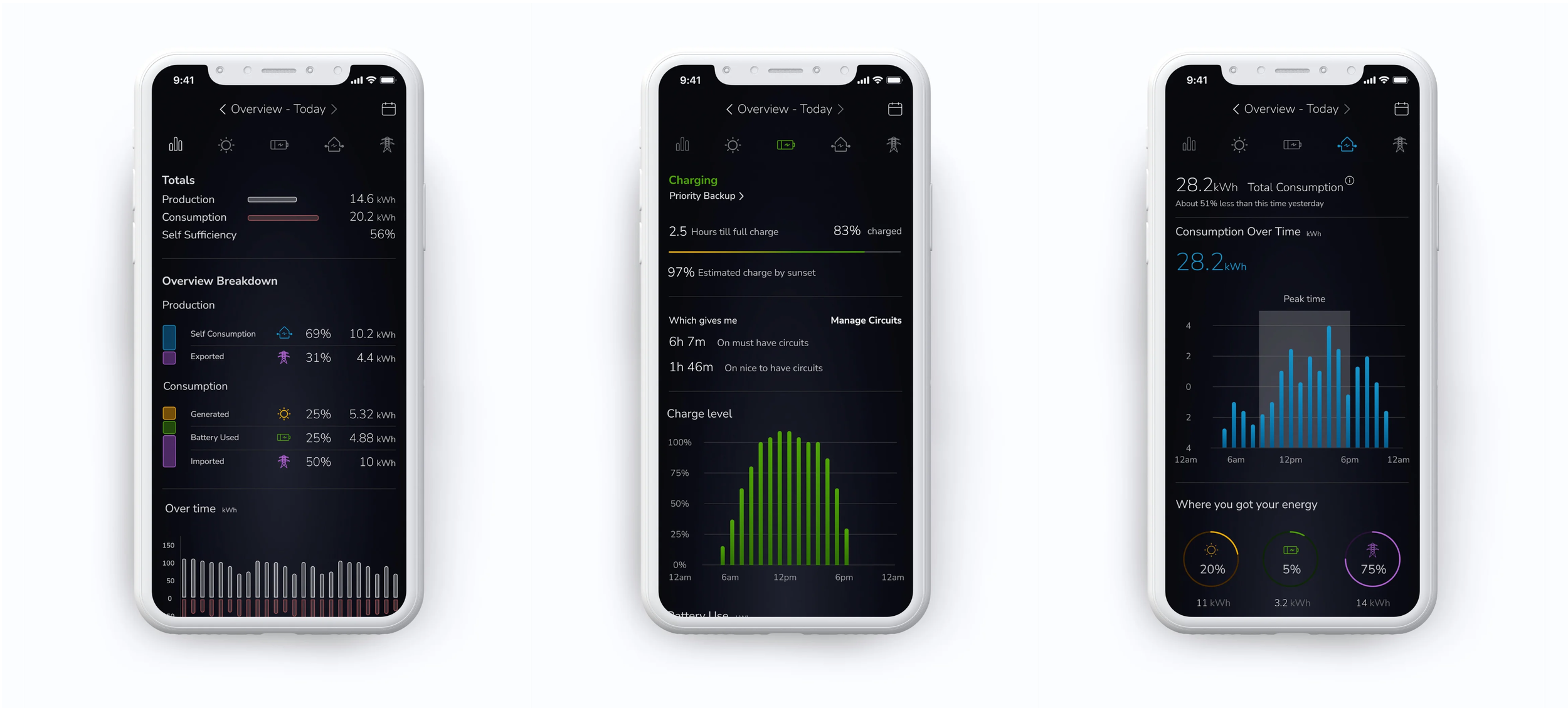
The original PWRview app gave homeowners access to home energy consumption, solar generation, and energy storage. For customers investing in connected energy hardware, the practical question was simple: Is my system operating as expected, where is my power coming from, and how much energy independence do I have?
I was brought in to redesign the iOS experience at a point when the software no longer reflected Generac's hardware quality or broader brand direction. The app contained important data, but its presentation did not give homeowners a clear mental model of how the home, solar panels, battery storage, and grid operated together.
Product and UX Strategy
iOS Mobile App UX/UI Design
Energy Data Visualization
Custom Illustration and Iconography
Design System and Interaction Patterns
Scope
Role & Ownership
I led the mobile-app redesign and owned the overall UX direction and visual design. I reworked the information hierarchy for home energy monitoring, created the energy-flow model, designed status and reporting experiences, and developed the custom illustrations, iconography, color conventions, and interaction patterns that tied the product together.
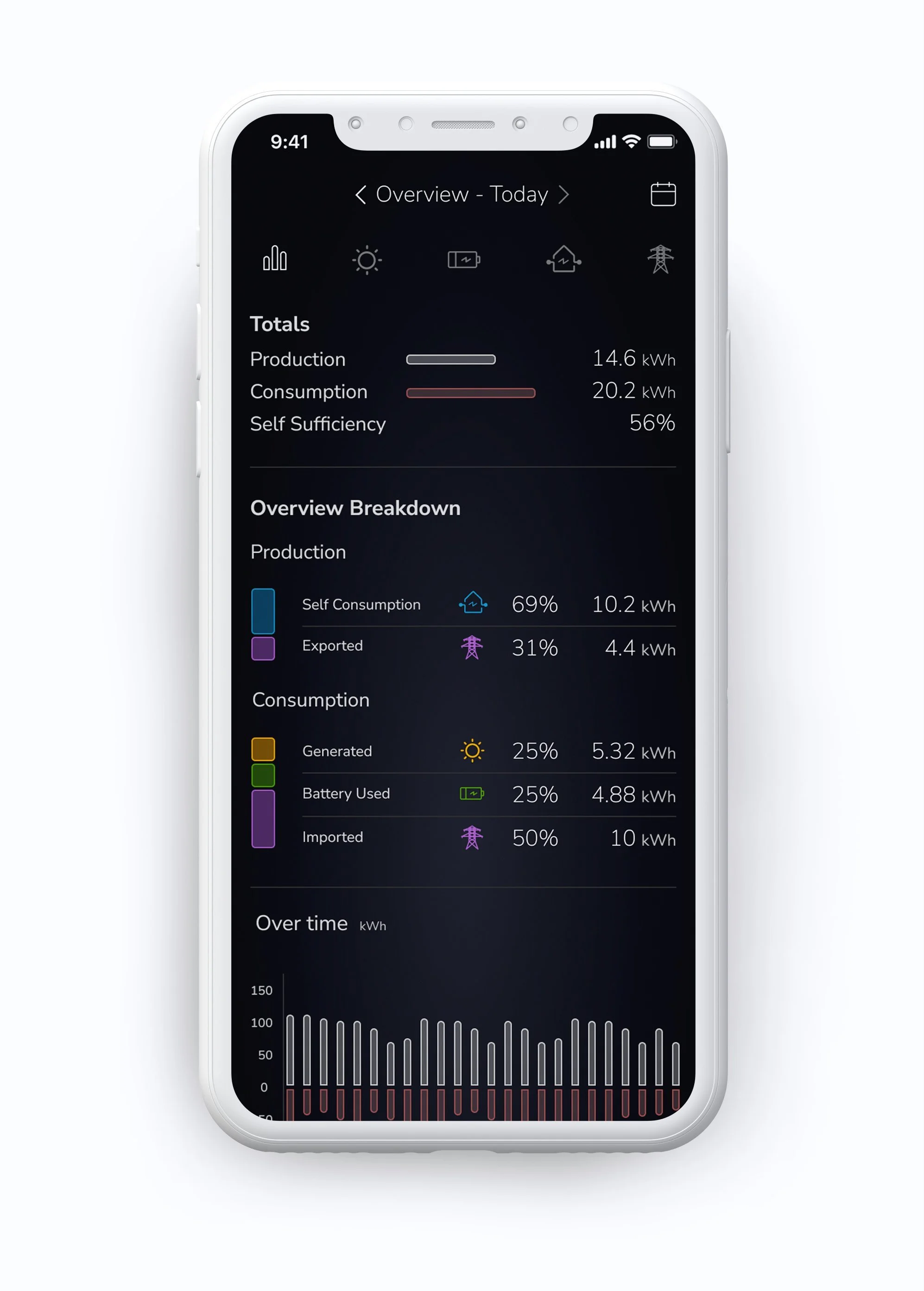
The work covered the home experience, high-level system overview, detailed production and consumption reporting, solar performance, battery status and charging, grid interaction, and device-status views.
The Real Problem
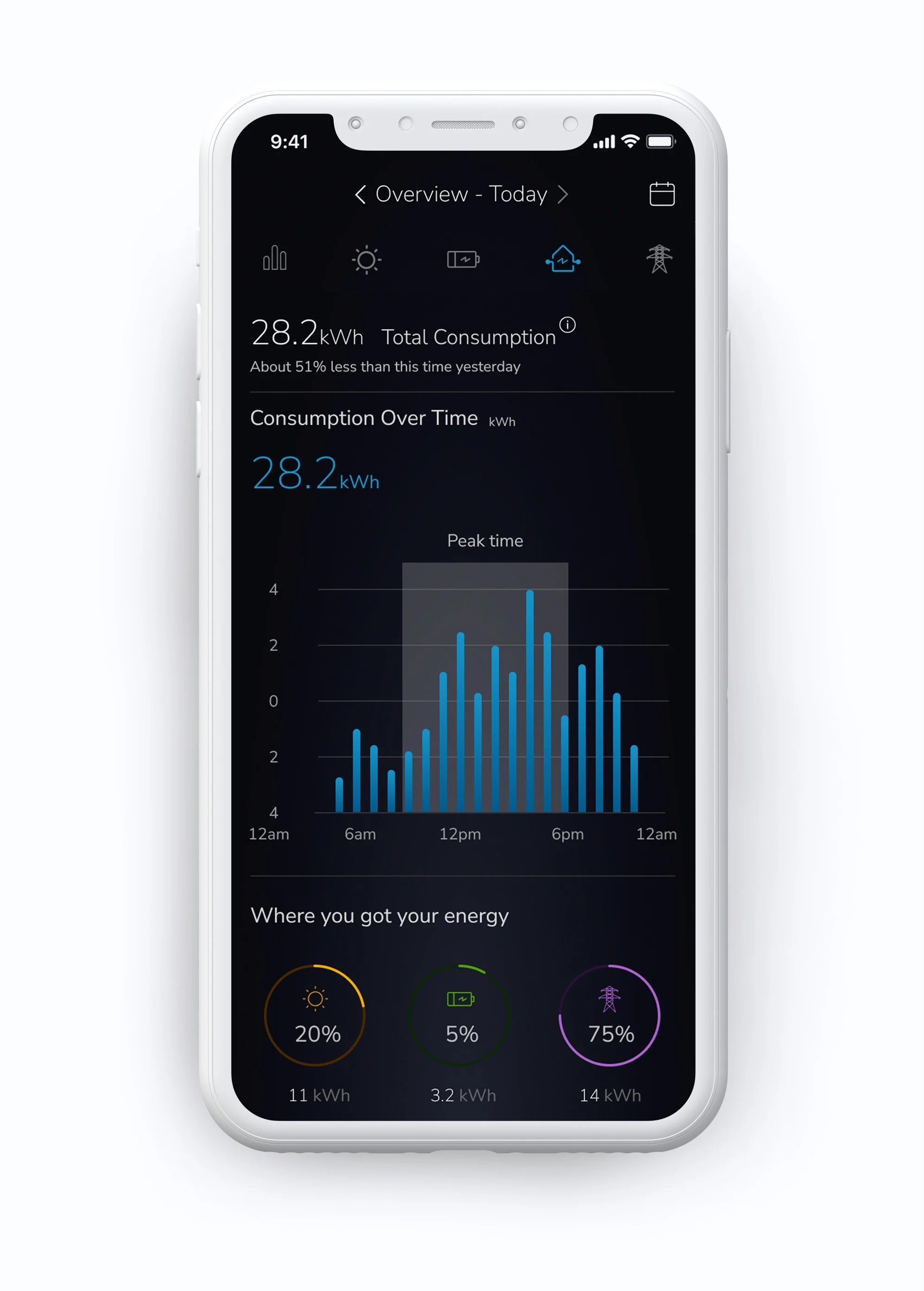
The challenge was not a lack of data. It was turning a connected energy system into something a homeowner could read with confidence. Solar generation, battery storage, grid import and export, household consumption, reserves, and equipment status all had different meanings, but could not be presented as disconnected metrics.
The app needed to support two modes of understanding: an immediate answer to “What is happening now?” and deeper detail for people who wanted to examine production, consumption, battery behavior, and system performance over time. The experience also needed to feel consistent with a premium, connected-hardware brand.
What Changed / Outcome
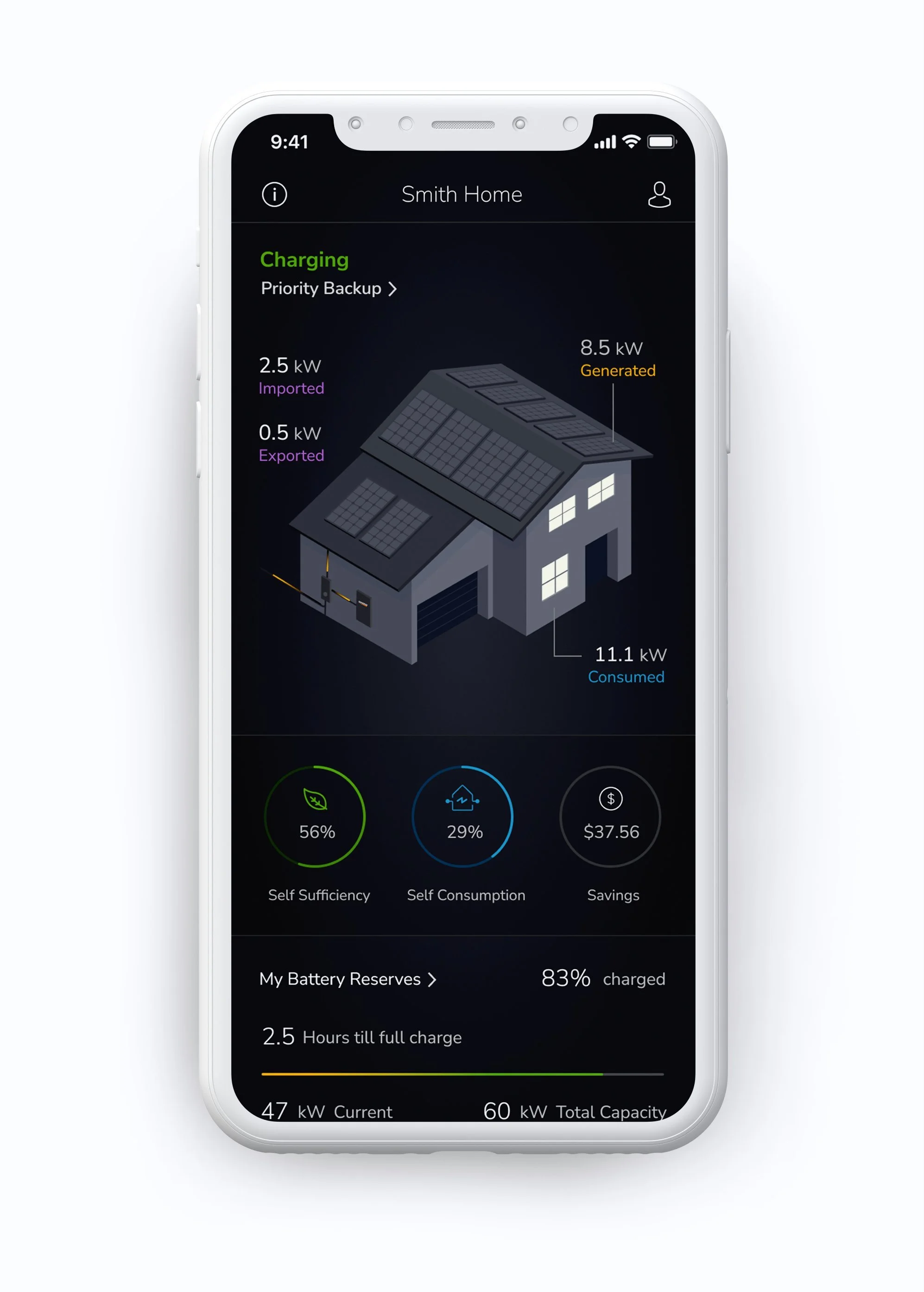
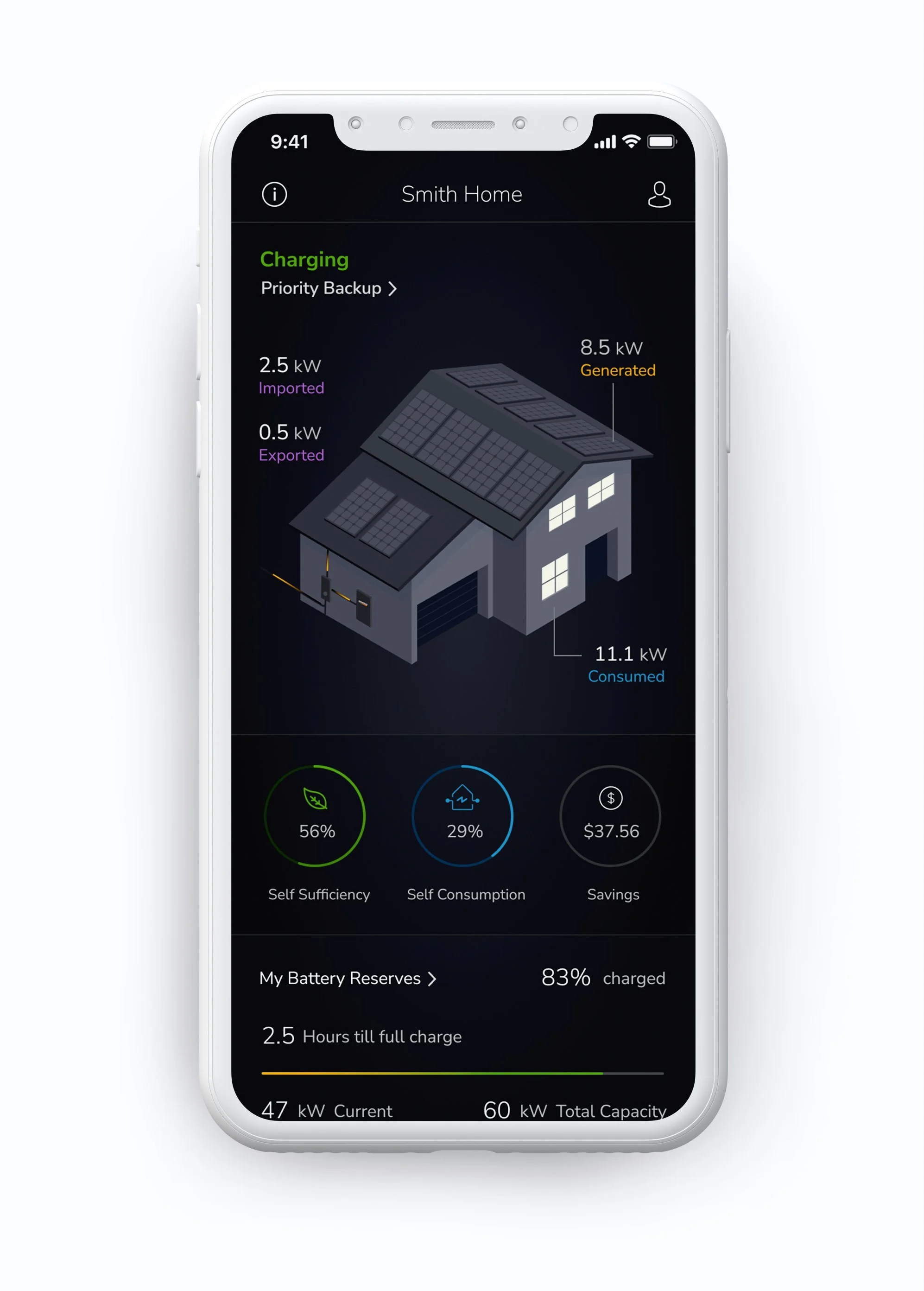
I designed the home screen around a custom illustrated energy-flow model, connecting the house, solar panels, battery, and grid to the numbers customers were seeing. A consistent system of icons and color made it easier to distinguish where energy was generated, stored, imported, exported, and consumed.
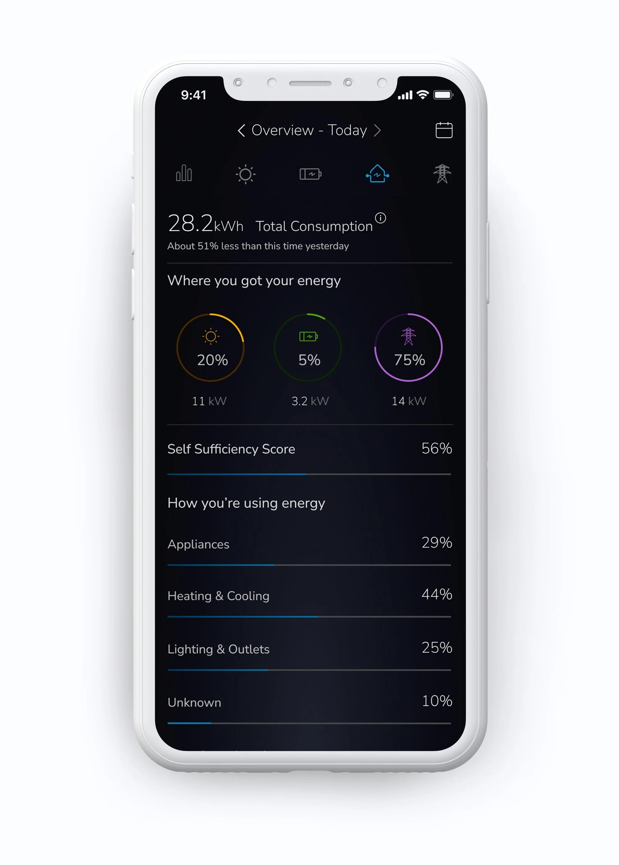
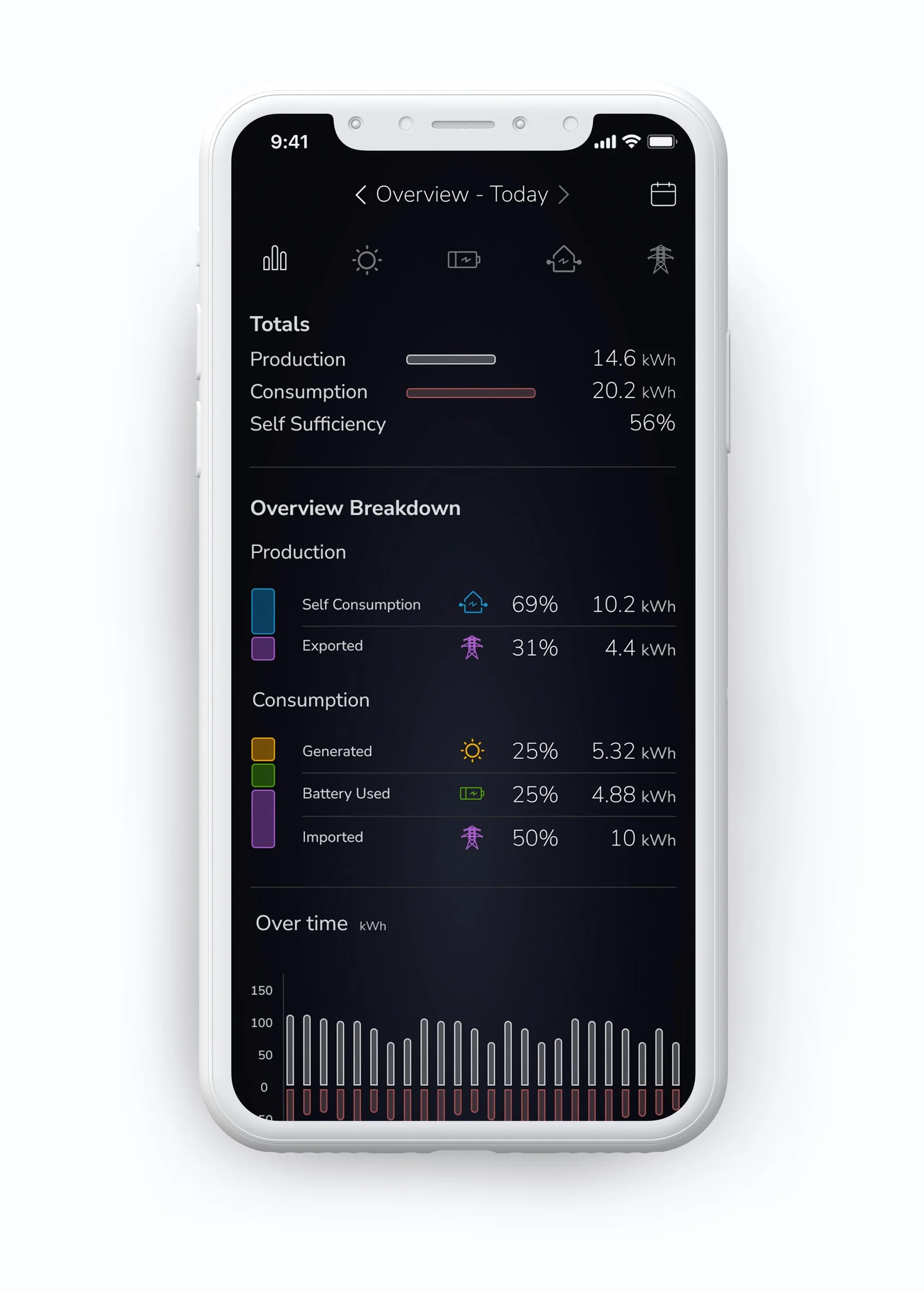
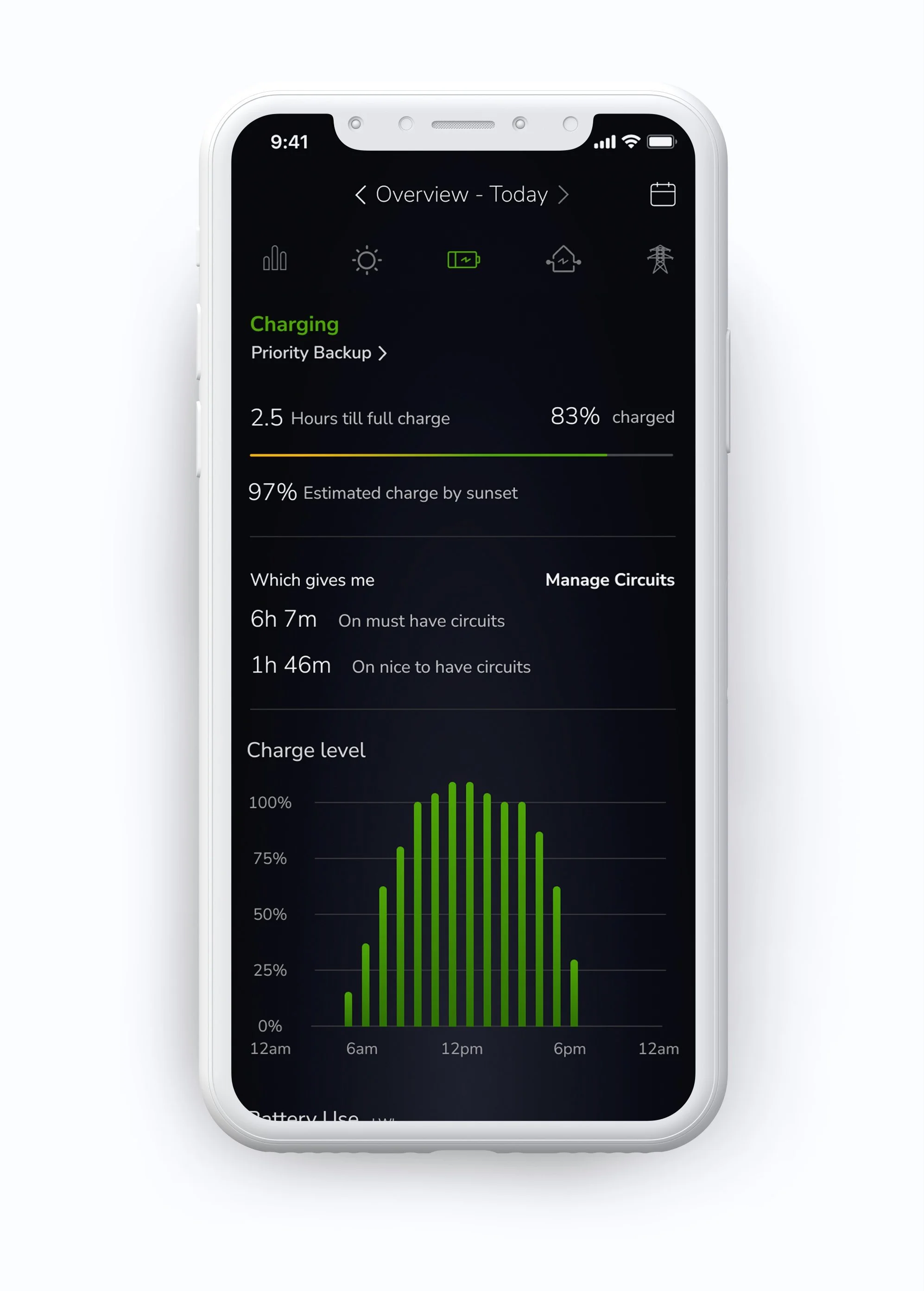
The redesigned hierarchy moved from high-level status into deeper views. Homeowners could see operating mode, self-sufficiency, self-consumption, savings, and battery reserves at a glance, then move into reports, time-based charts, solar-generation detail, device status, and battery-management concepts when they needed more context.
The work produced a cohesive end-to-end iOS design direction for a complex connected-energy product. It established a clearer visual and interaction system that aligned PWRview with Generac's hardware and brand. Production release, usability results, adoption, energy savings, and other measurable outcomes are not verified.