Generac
Redesigning Generac’s consumer energy app to modernize the experience and align the software with the premium quality of its hardware and brand.
I was brought in to lead a redesign of Generac’s consumer energy app at a time when the experience no longer reflected the company’s scale, brand, or product quality. Visually, the app felt dated, and from a UX standpoint it lacked the clarity and polish expected from a premium hardware brand.
There was internal pressure to modernize the experience and improve usability, with a clear mandate to elevate the look and feel while also refining the underlying user experience. The goal was to bring the software in line with Generac’s broader brand expectations and future product direction.
Product Strategy
UX Strategy
Mobile iOS App UX & UI Design
Design System & Interaction Patterns
Scope
Role & Ownership
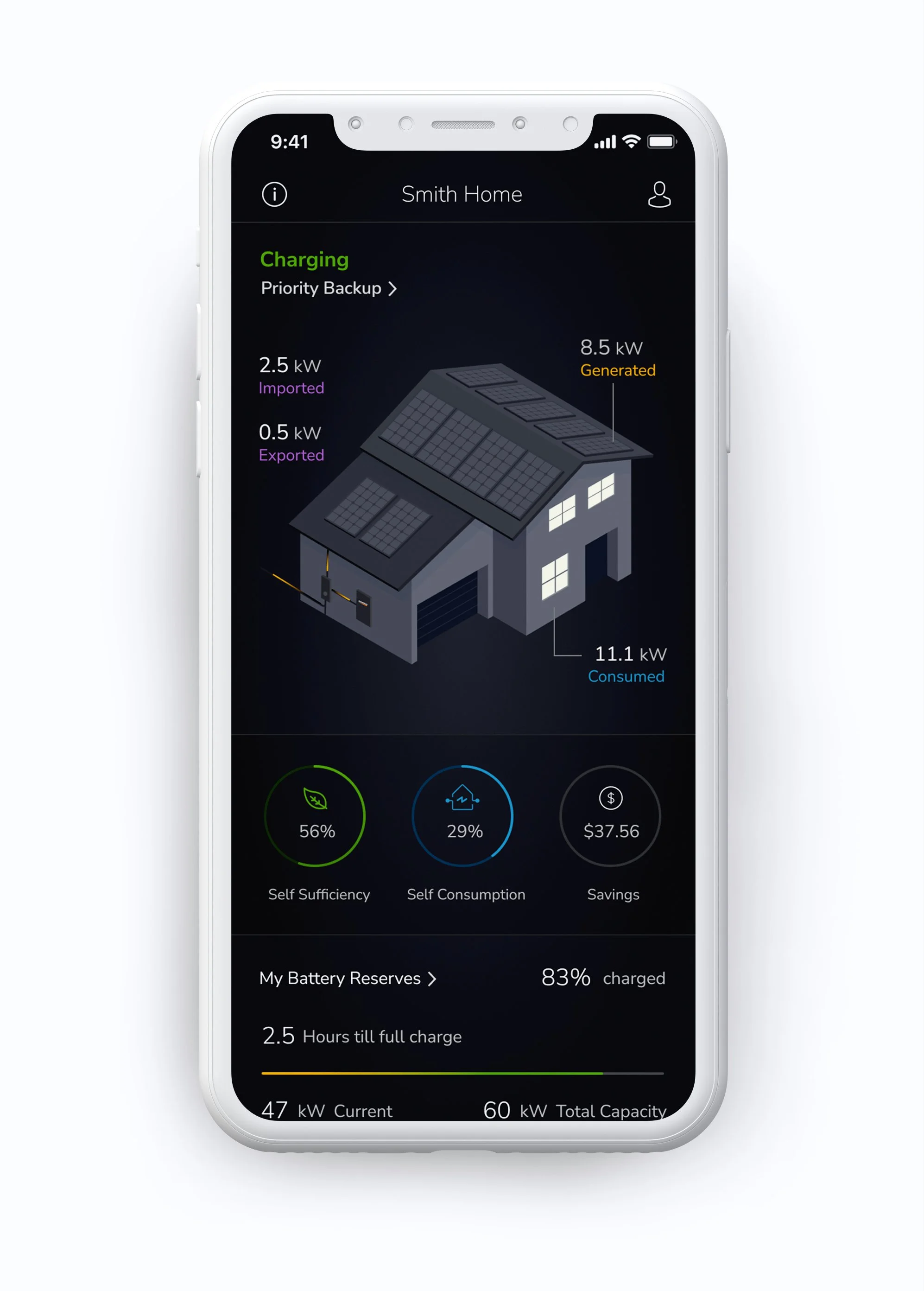
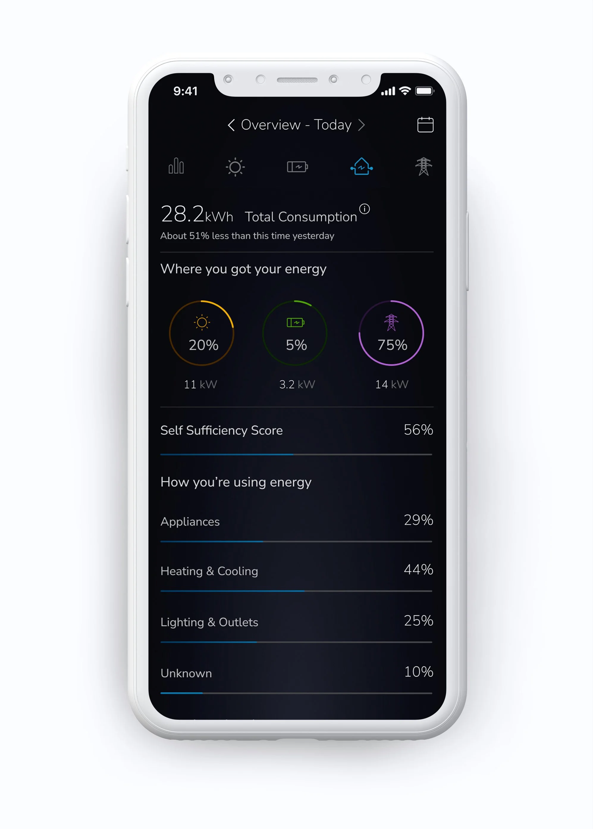
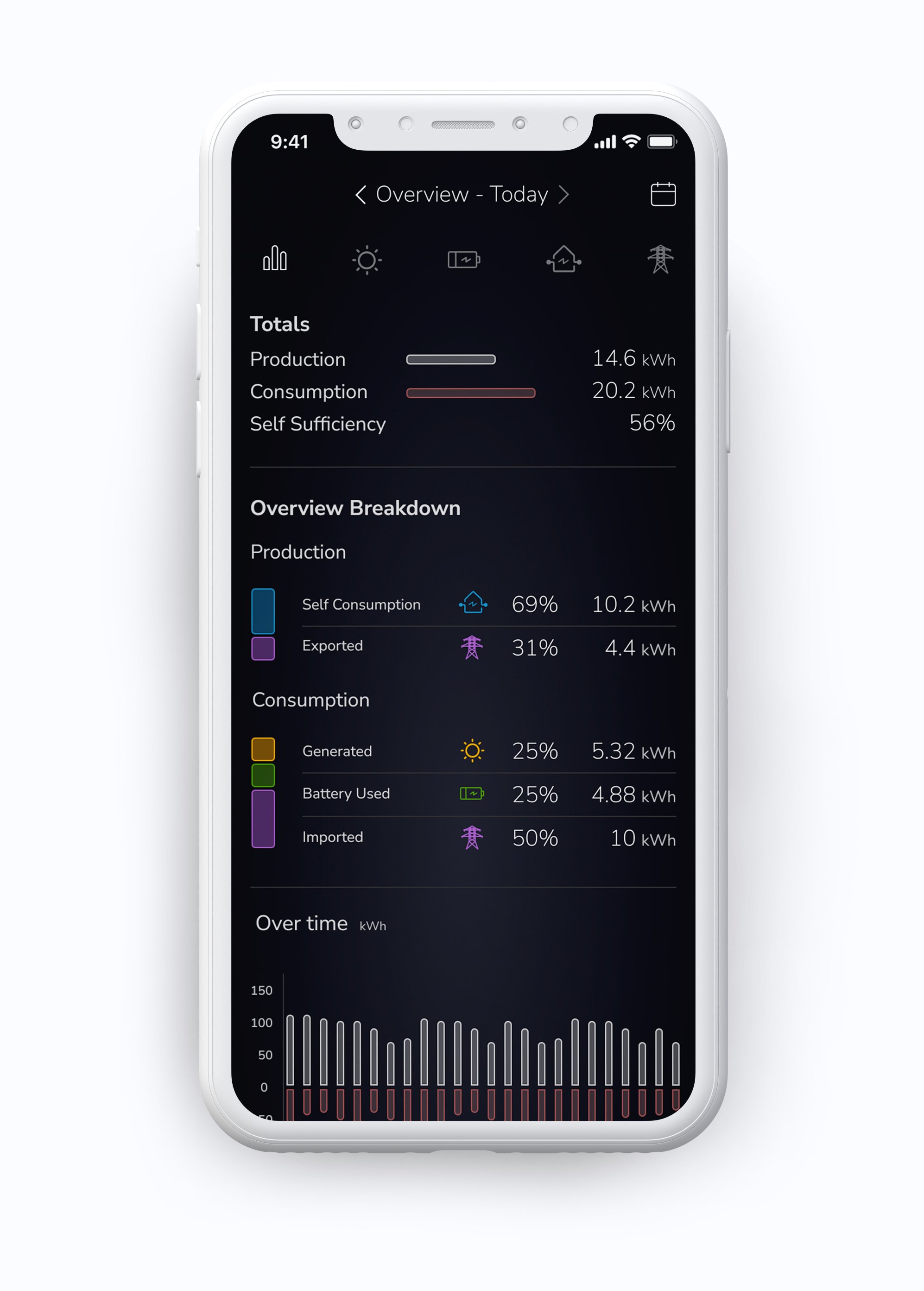
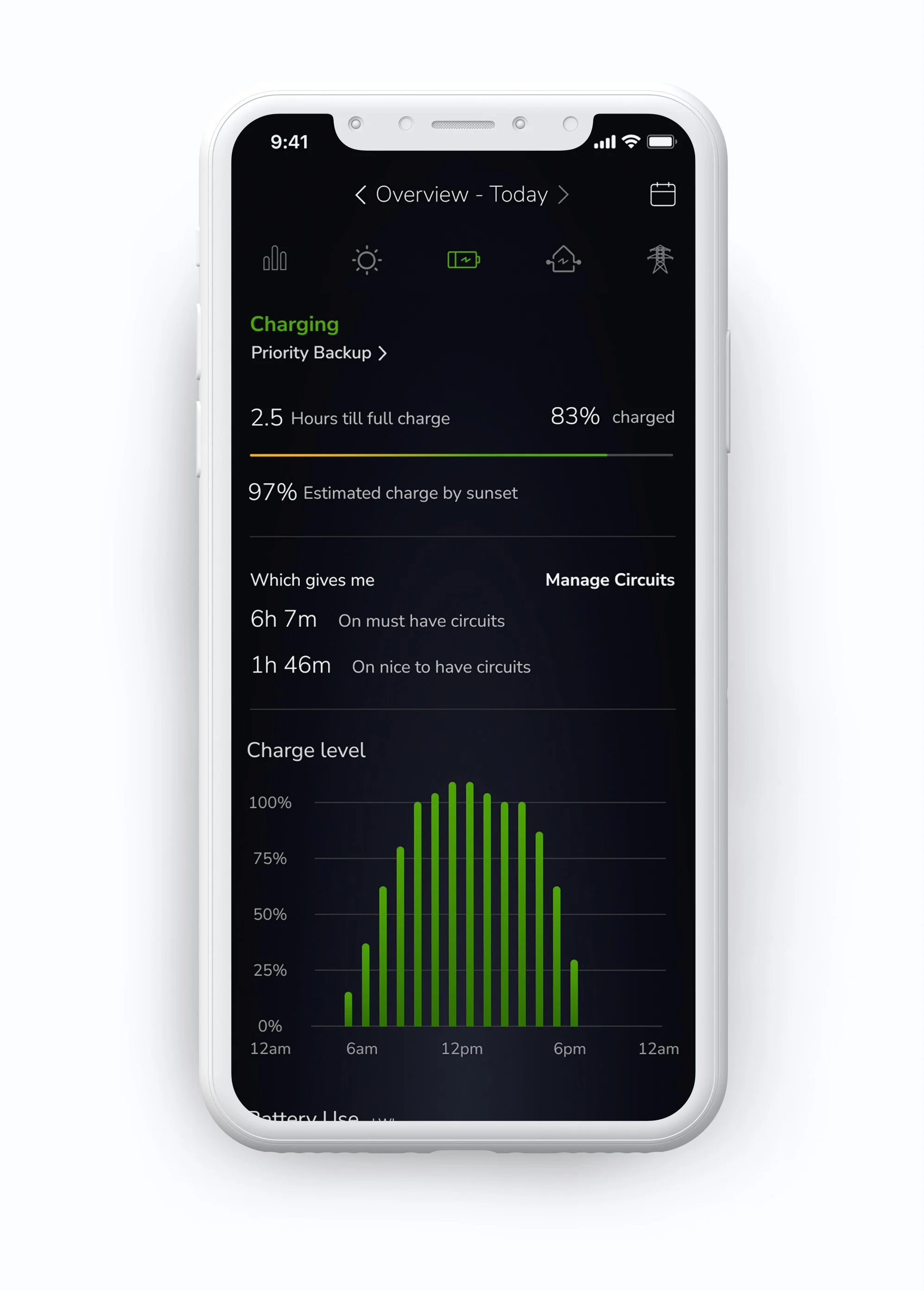
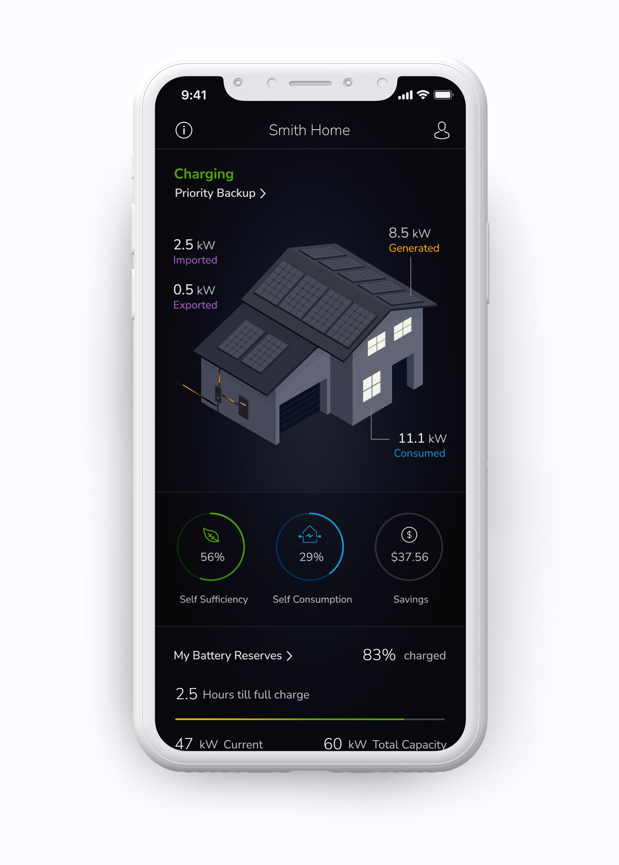
I was responsible for leading the redesign of the Generac mobile app, including the overall UX direction and visual design. This included creating highly domain-specific illustrations and iconography to clearly communicate how power flowed through the home, the grid, and the Generac system.
I designed the experience end to end for iOS, focusing on clarity, visual hierarchy, and interaction patterns that made complex energy concepts easier to understand at a glance.
The Real Problem
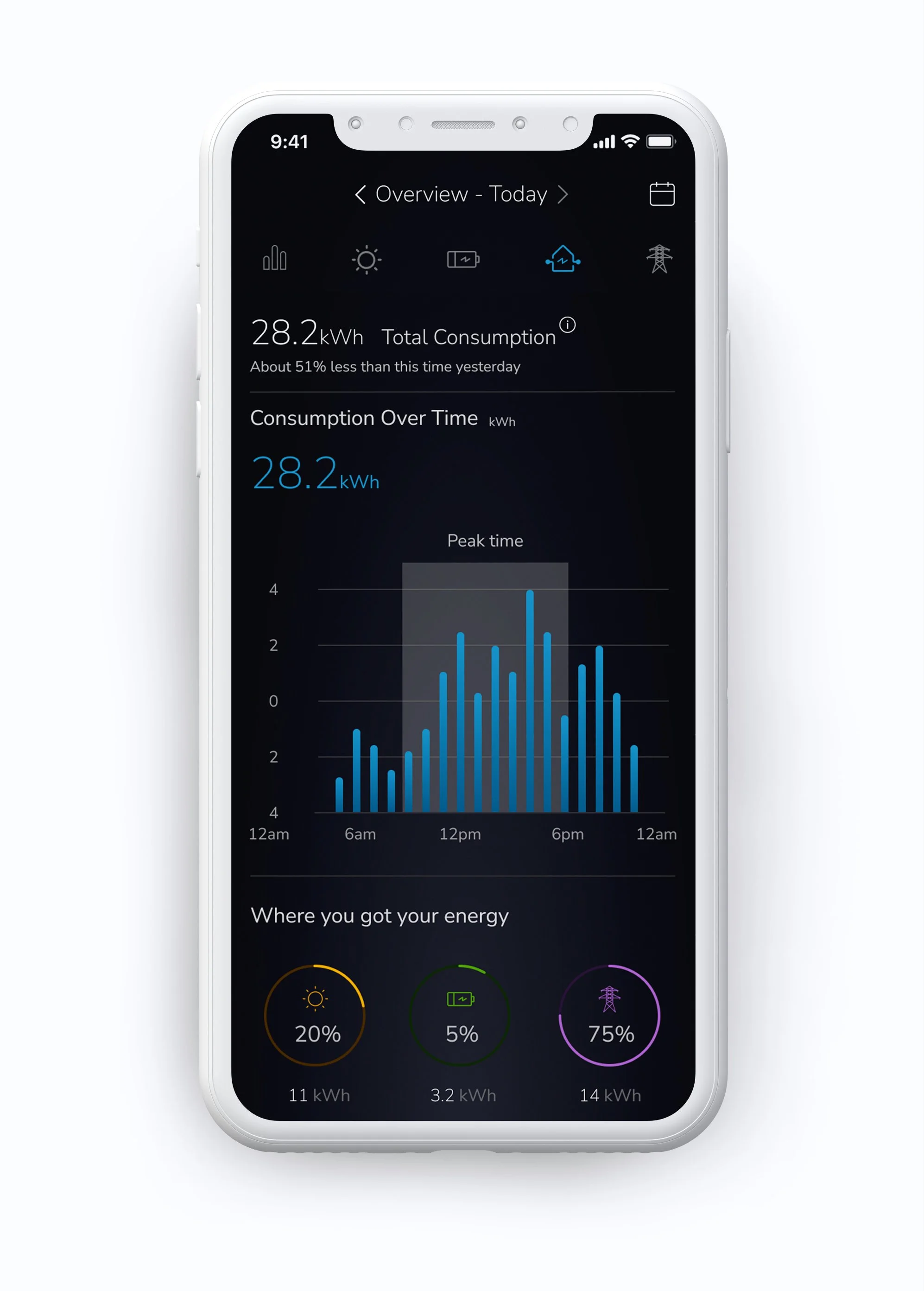
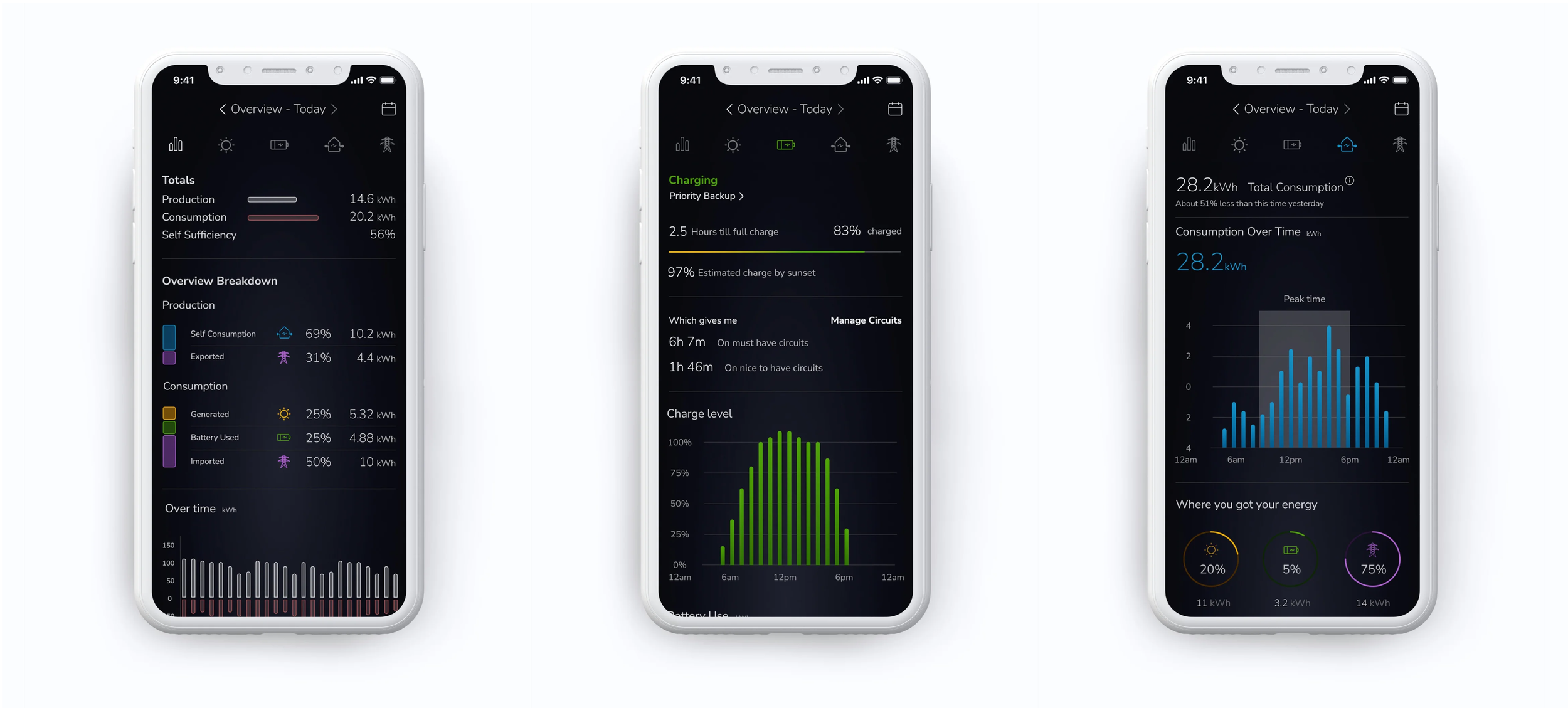
The existing app did not clearly communicate how energy moved through a user’s home, the grid, and the Generac system. Users struggled to understand where their power was coming from, when it was being used, and how production and consumption related to one another.
Key metrics and energy states were visually unclear, making it difficult for users to confidently interpret their system’s behavior. As a result, the app failed to effectively educate users about their energy usage or reinforce trust in the underlying hardware.

What Changed / Outcome
The redesigned app made complex energy data easier to understand at a glance. Users could quickly navigate between high-level system status and detailed views of energy production, consumption, storage, and grid interaction.
Clear visual hierarchy, simplified iconography, and intentional use of color helped users interpret where their energy was coming from and how it was being used, even within a dense data environment. As a result, the app became more intuitive, educational, and aligned with the premium experience expected from Generac’s hardware and brand.